This site uses cookies. By using the apart website you are agreeing with our Cookie Policy.
Logo & branding for Manon Bock, personal fitness coach. The logo shows the Initials of Manon Bock and reflects the workout repetitions, heart rate, performance and progress curves in an elemental monochrome new logo.
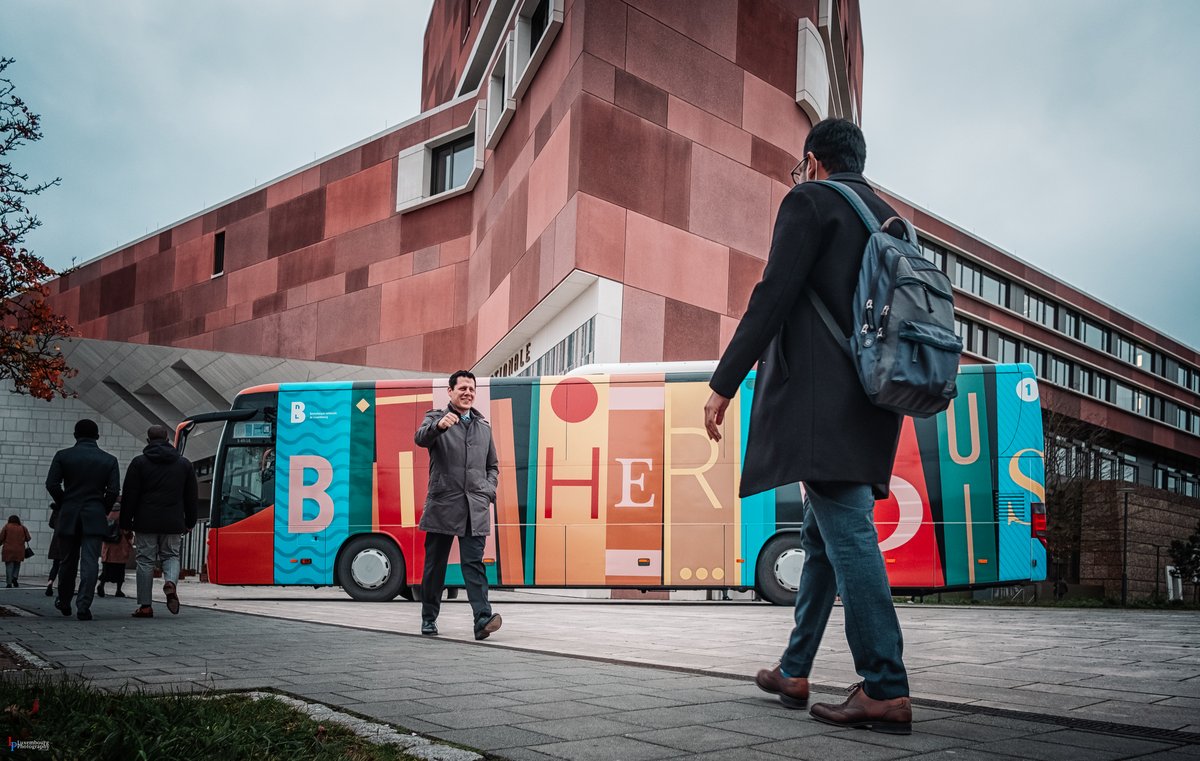
Since its launch in 1982, the Bicherbus service has been continuously reinvented, improved and redesigned. In 2021, we gave the Bicherbus a new look that literally conveys the concept of the service: a library on wheels.
Spuerkeess' Mobile Onboarding makes opening a current account online a breeze. With the slogan: "Check this out" along with an illustration of a surfer, breaking the waves on credit/debit cards and money, the message was clear: it is such a hassle-free process, anyone can do it, anytime, anywhere.
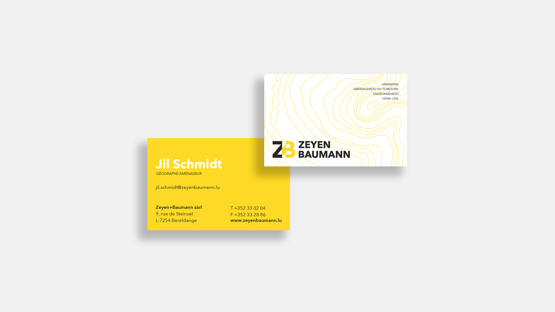
Zeyen Baumann's corporate identity has become as multidisciplinary and utilitarian as its team. The shapes are more than patterns. They transform into cartography and topography designs, revealing the office's field of activity and experience.
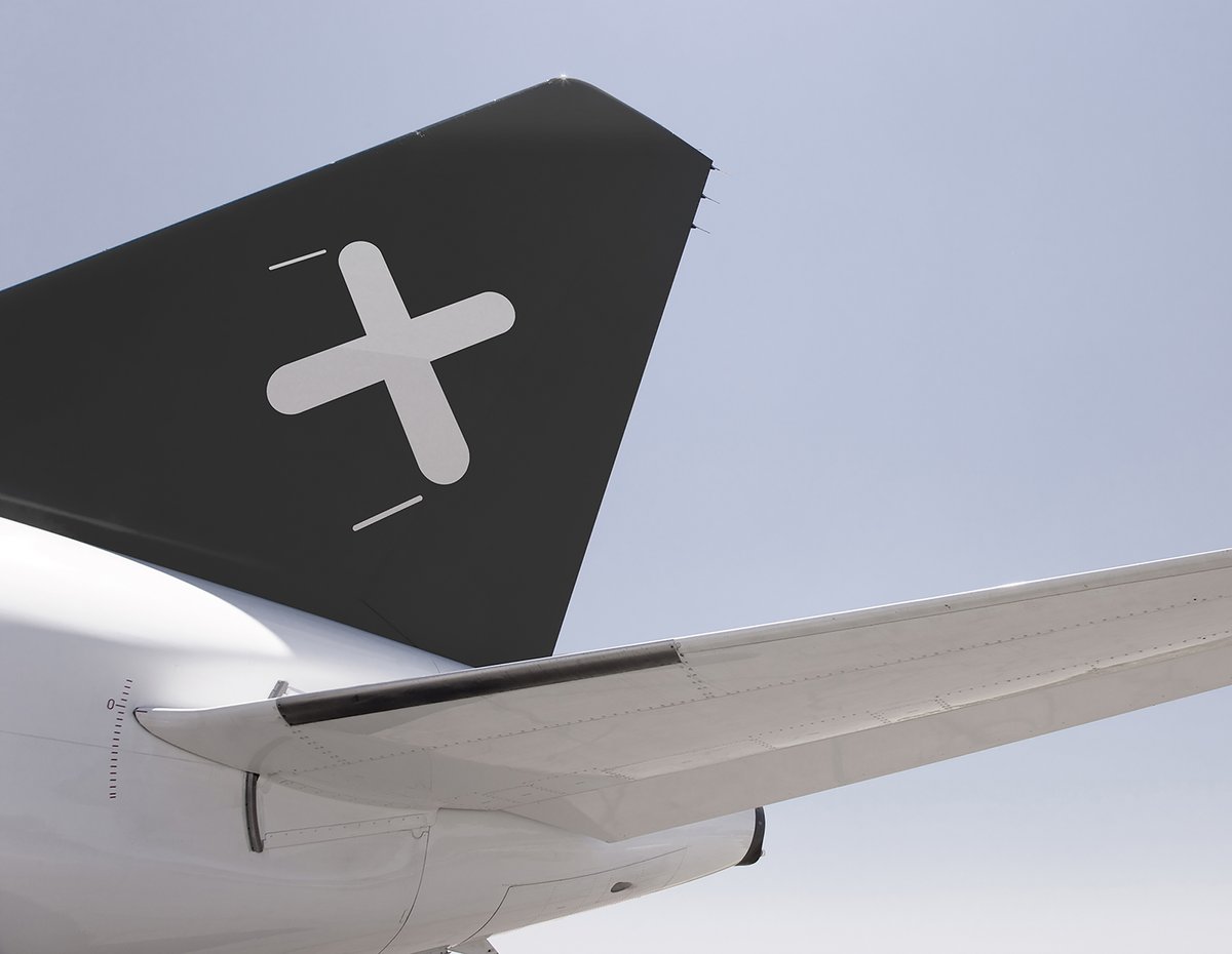
For Luxaviation new visual identity, we linked distinction and discretion with an "x", representing LuXaviation, LuXembourg and the luXury of travelling in a private jet.
The Luxembourg City Museum is a fundamental pillars of Luxembourg’s culture. In honour of that, we designed a colourful and enticing digital identity, filled with imagery to spark excitement. Our aim was to encourage visitors to look at what’s on and for them to discover just enough to come and explore the museum.
Read more about the development and inspiration behind the new visual identity for Musée Dräi Eechelen: the new kid in town.
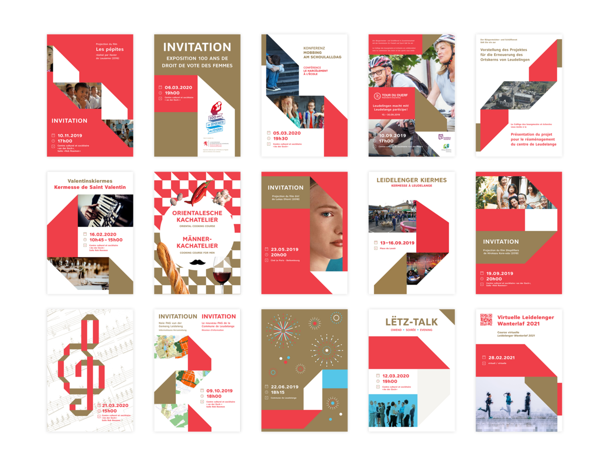
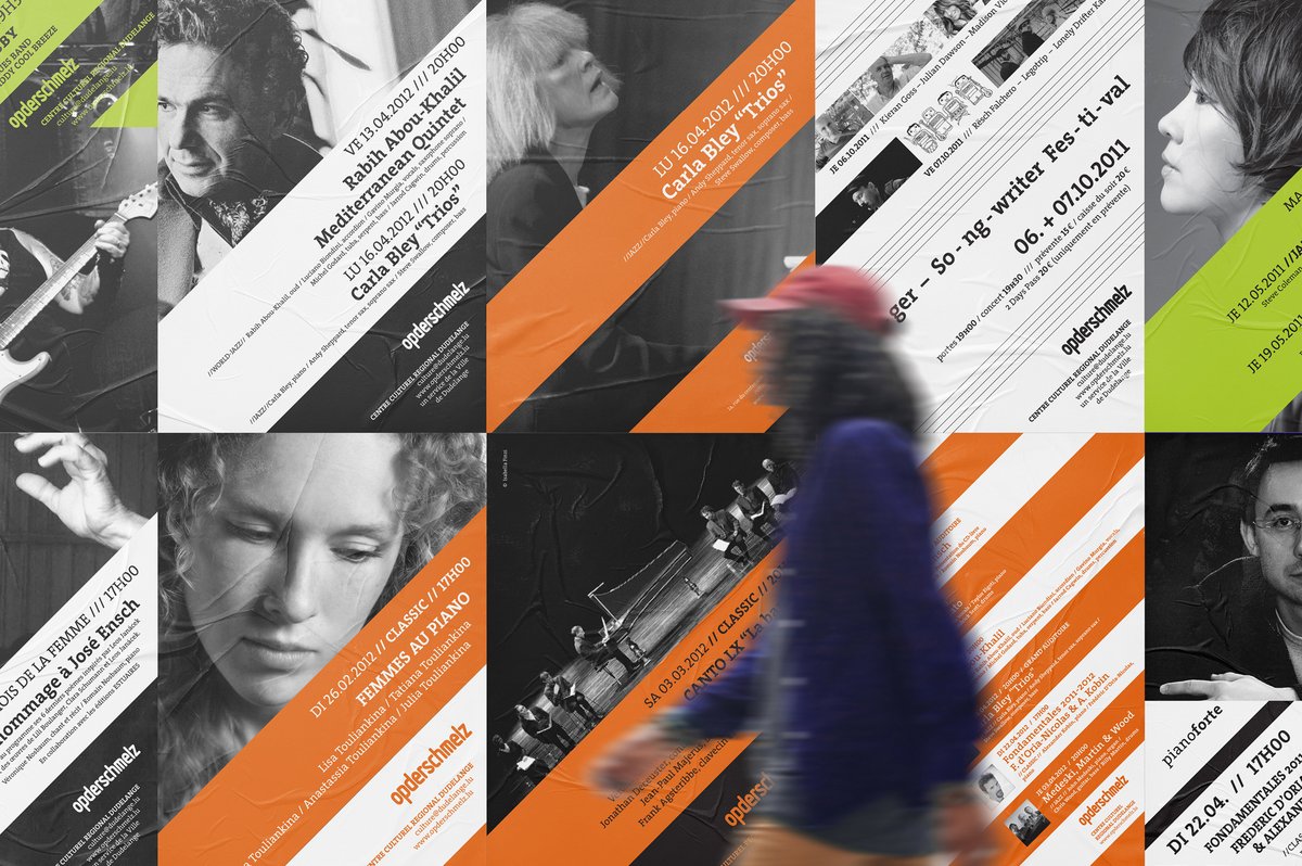
Opened in December 2007, the cultural centre presents all kinds of exclusive events for a varied public. The corporate identity is based on the “Work in progress” –diagonal red and white stripes. The signposting is direct and efficient and ties in with the mining tradition of the site. It makes for simple and efficient communication - “attention: culture” – but also a more subtle message concerning cultural “work”. A slightly transformed Isonorm typography is used for the logo and titles and TheSerif for the running text.